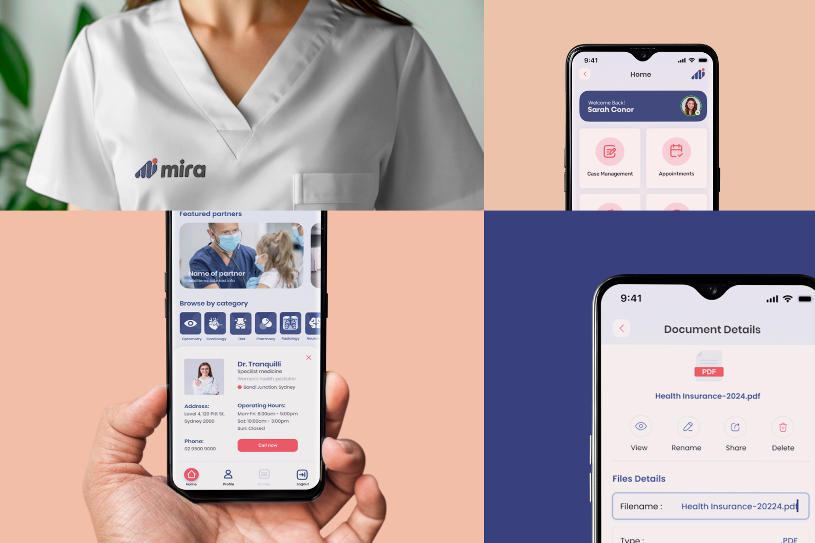
Cheers to helping the light at the end of the tunnel shine brighter for those in recovery. MiRA is a comprehensive platform designed to streamline communication and collaboration among stakeholders involved in the recovery process of injured or ill individuals.
Services
Client
Year
Website

Challenge
Our client needed both a new brand identit and a design overhaul for an existing app, previously built without much consideration to its design.
The brief asked to modernize and elevate MiRA’s brand identity to reflect its innovative, inclusive, and empowering nature, whilst communicating MiRA’s commitment to revolutionizing healthcare, empowering individuals in their recovery journey, and enhancing communication between stakeholders (organisations <-> injured individuals <-> healthcare).

Goal
We did some comprehensive market research, refined their brand identity, and gave their app a bit of a facelift to truly showcase their forward-thinking and tech-driven identity.
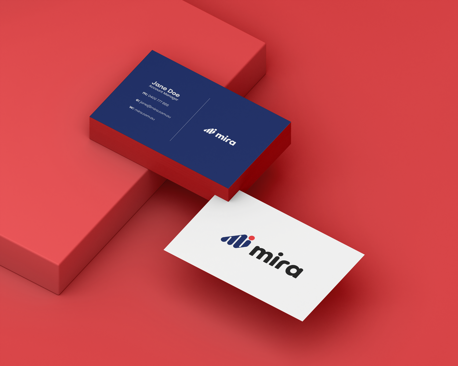
The concept behind the logo was to depict an abstracted m & i from the first two letters of the name MIRA, conjoined. The two letters focus on the individual, the “mi (me)” as the central patient and subject. The interpretation of the three strokes of the letter M is two-fold: it represents the three stakeholders involved in the recovery of the patient, and, a tribute to the original logo that contained three panels that represented the three company values of collaboration, care and access.
Result
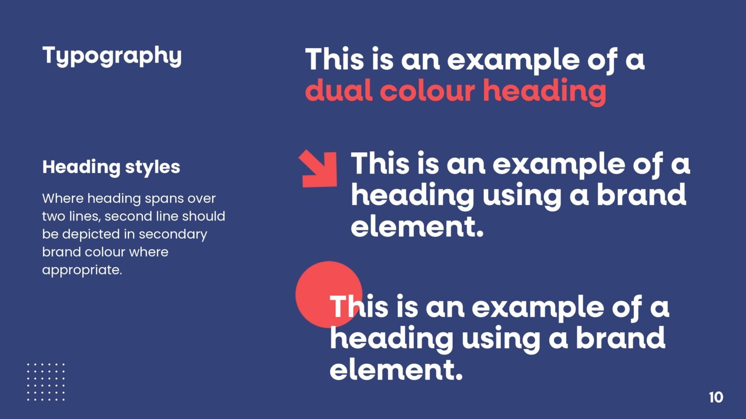
The rebranded color palette utlizes a red (albeit soft) as per the universal color for healthcare (think red cross). The selected secondary blue color, is a perfect cool hue to compliment the soft red.
The comprehensive initiative, extending beyond visual changes, resonated authentically with the audience, resulting in heightened engagement metrics and a tangible boost in sales. The company now stands on a more robust foundation, embodying a stronger and more compelling brand presence, setting the stage for continued success in the competitive market.
Bringing back visitors to the world of craft beer! Such an exciting journey!


